


People arrive on your website looking for something, whether they came from a Google search, an email or a link on another site.
A traffic report can tell you they arrived. It can’t tell you whether they found what they came for.
That gap matters because a busy page and a working page aren’t the same thing. A page can pull steady visits and still lose readers within seconds.
Engagement metrics close that gap. They show whether visitors stayed, read, came back or took the action you hoped for.
In this guide, we’ll walk you through the metrics to measure user engagement in Google Analytics, including where to find each one and how to read it.
In This Article:
Why User Engagement Metrics Matter More Than Traffic Counts
User engagement metrics matter because a traffic count only tells you how many people showed up. It says nothing about what they did once they got there.
Google Analytics builds its reports around engagement. It counts engaged sessions and reports an engagement rate, and it defines bounce rate as the share of sessions that weren’t engaged.
That gives you a sharper question to ask of every page. Instead of asking how many people left, you can ask how many people found something worth their time.
The answer points you toward specific fixes. A page with strong traffic and a low engagement rate may need a clearer answer near the top.
A channel that sends plenty of sessions but few engaged ones may be reaching the wrong audience. For ideas on lifting those numbers, see our list of ways to increase user engagement.
Raising these numbers won’t improve your search rankings by itself, because Google doesn’t use Google Analytics data to rank pages. The work behind the numbers still pays off in search, though.
Answering the question sooner and offering a clear next step make a page more useful to the people who land on it. Google says its ranking systems are designed to prioritize helpful, reliable content like that.
What Counts as Engagement in Google Analytics
Engagement in Google Analytics starts with the session, so it helps to know exactly what turns an ordinary visit into an engaged one. Every metric in this guide builds on that definition.
A session counts as engaged when it lasts longer than 10 seconds, includes two or more page or screen views, or records a key event. Google lays out the same criteria in its engagement rate and bounce rate guide.
The 10-second threshold is only the default. You can change it in your web data stream’s tag settings, under Adjust timer for engaged sessions.
Engagement time works differently from session length. Google Analytics counts only the time your page was in focus in the visitor’s browser, not the time a tab sat open in the background.
The Google tag collects that focused time as the visitor moves around, sending it with events such as user_engagement. Google Analytics then adds it up for its engagement time metrics.
9 User Engagement Metrics to Track in Google Analytics
The nine user engagement metrics below each answer a specific question about your visitors, such as whether they stayed, came back or took action.
| METRIC | WHAT IT TELLS YOU | WHERE TO FIND IT |
|---|---|---|
| Engagement Rate | The share of sessions where visitors engaged with your site | Acquisition » Traffic acquisition |
| Bounce Rate | The share of sessions that weren’t engaged | Any report, added with Customize report |
| Average Engagement Time per Page | How long people actively spend on each page | Engagement » Pages and screens |
| Engaged Sessions per Active User | How many engaged visits each person has on average | Engagement » Overview |
| Views per User | Whether visitors go beyond the first page they see | Engagement » Pages and screens |
| New vs. Returning Users | How many visitors come back after their first visit | Retention |
| Key Events (Conversions) | Whether visitors take the actions you care about most | Engagement » Events, or Explore |
| User Stickiness | How often the month’s visitors return within a day or a week | Engagement » Overview |
| Scroll Depth and Event Count | How far down the page people get and how often tracked actions happen | Engagement » Events |
Engagement rate and bounce rate come first because they’re two views of the same number. The rest move from how long people stay to whether they return and act.
The report paths in this guide follow the standard Google Analytics Reports menu. If you chose business goals when you created your property, your menu uses different headings, and an admin can add the standard reports from Library at the bottom of the Reports menu.
1. Engagement Rate
Engagement rate is the percentage of your sessions that Google Analytics counted as engaged. A session qualifies when it passes the 10-second default timer, reaches a second page or screen view, or records a key event.
Engagement rate is the exact inverse of bounce rate, so the two always add up to 100%. Instead of counting the percentage of sessions that bounce, it counts the percentage that are engaged.
You can find the engagement rate metric in several places in Google Analytics. The Reports » Acquisition » Traffic acquisition report is a good place to start. It shows engagement rate for each channel that brought visitors to your site.
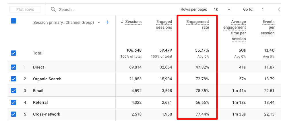
A channel whose engagement rate trails the others is worth a closer look. The gap can point to a mismatch between what visitors expected and what they found.
How to Improve Engagement Rate
Raising your engagement rate comes down to giving visitors a reason to stay past the first few seconds. These changes can help:
- Make your content engaging, unique, and easily scannable
- Have a very clear call to action on every page of your website
- Use internal, contextual links in your text to other relevant pages on your website
- Dial in search intent for every piece of content you publish
- Try A/B testing different elements on your website to see what gets more interaction or keeps people around longer
- Use a popular posts widget to draw your readers deeper into your site
We’d suggest making one change at a time and comparing the engagement rate before and after. That way, you’ll know which change moved the number.
2. Bounce Rate
Bounce rate is the percentage of sessions that weren’t engaged. Because it’s the inverse of engagement rate, an engagement rate of 60% means a bounce rate of 40%.
Bounce rate is still a Google Analytics metric, but most standard reports leave it out. To see it, you add it to a report yourself.
Open Reports » Engagement » Pages and screens and click Customize report, the pencil icon in the top right. Under Report data, click Metrics, then click Add metric and start typing “bounce.”
Select Bounce rate from the matches, then click Apply to add the column to the table.
Then click Save at the top of the report and choose Save changes to current report so the column stays.

For more detail, including how to find bounce rate in an exploration, see our guide to finding your bounce rate in Google Analytics.
A high bounce rate isn’t automatically bad news. A contact page or a quick-answer post can bounce because the visitor got what they needed in a few seconds.
When a high bounce rate is a real problem, the fixes overlap with the engagement rate tips above. A clearer headline, a faster page and an obvious next step can all help.
Two Sides of One Number
Engagement rate and bounce rate always add up to 100%, so tracking both tells you the same thing twice. Pick the one that reads more naturally for the page, and watch how it moves over time.
3. Average Engagement Time per Page
Average engagement time per page shows how long people actively spend with each page on your site. Like all engagement time in Google Analytics, it counts only focused time, not time a tab sat open in the background.
To find this metric in Google Analytics, navigate to Reports » Engagement » Pages and screens, then scroll to the table.
Depending on your screen size, you might have to scroll the table to the right a little bit to find the Average engagement time column. For each page, that column shows the average focused time per active user who viewed it.

Are there any engagement times here that surprise you? Do you have some pages that you think should be getting longer visits?
A page with a strong call to action can have short visits because people are moving on to your conversion page. Some pages are also meant for short visits.
For instance, say your site is a blog, and the average engagement time for your home page is low. That can be fine, because it can mean visitors are moving on to the posts they came to read.
If you do want visitors to spend longer on a certain page, start with what they see first. It helps to put the answer they came for near the top, so they don’t have to hunt for it.
Short paragraphs and descriptive subheadings make a long page easier to scan. Ending with a clear next step, such as a link to a related guide, keeps the visit from stopping at the bottom of the page.
4. Engaged Sessions per Active User
Engaged sessions per active user shows how many engaged sessions each visitor has, on average, in the date range you pick.
This metric separates two sites that can look identical on engagement rate. On one, each person has a single engaged visit, while on the other, people come back and engage several times.
You’ll find it as a summary card in Reports » Engagement » Overview (the report opens as Engagement overview). That’s the default layout, and anyone who can edit your reports can swap the cards. Google’s Engagement overview report guide lists it among the report’s default summary cards.

A value of about 1 means a typical visitor has one engaged session in the period. A higher value means people return and engage more than once. A value below 1 means some active users never had an engaged session at all.
A longer date range gives people more time to return, so it’s best to compare periods of the same length. To raise the number, look at the retention tactics under new vs. returning users below.
5. Views per User
Views per user measures how many pages or screens each active user views, on average. Repeat views of the same page count too.
This metric shows whether visitors explore beyond the page they landed on. That matters for blogs and other content sites where one visit can lead to several articles.
In Reports » Engagement » Pages and screens, the Views per active user column shows the figure for each page. Google Analytics also has a Views per session metric, which you can add to an exploration if you’d rather count by visit.

A page with many views per active user may be one people return to often, such as a homepage or a resource page. A low figure on a blog post isn’t always a problem, since a visitor might read one article in full and leave satisfied.
Related-post links inside your content and at the end of each article give visitors an easy next page. To see which entry pages start those longer visits, see our guide to the Google Analytics landing pages report.
6. New vs. Returning Users
New vs. returning users splits your visitors into first-timers and people who’ve been to your site before. Keeping visitors coming back is called retention, and Google Analytics measures it in its Retention report.
You want to retain the users who visit your site once, whether they make a purchase or complete another key action.
To find the new vs. returning users stat in Google Analytics, navigate to Reports » Retention.

Here, you’ll see how many new and returning users you had in your selected time period.
If you’re wondering about the rest of the metrics in the Retention report, see Google’s Retention overview guide.
Growing your share of returning visitors is worth the effort on sites that depend on repeat visits, like blogs, membership sites and stores. It matters less on a site where one visit and one conversion is the whole goal.
How to Improve Retention
One of the most direct ways to improve your visitor retention rate is by including more ways to capture visitor information on your website.
Then, you can email them relevant content through an email newsletter they want to click on to return.
These tools can help with that:
- OptinMonster for capturing email addresses and other visitor information
- PushEngage for sending push notifications
- Constant Contact for sending email newsletters
Another good way to improve retention is to give visitors who don’t want to share an email address other ways to stay connected. Social media is one option.
A social feed plugin like Smash Balloon brings your social media feeds onto your website, so visitors can see your profiles and follow you.
7. Key Events (Conversions)
Key events are the actions that matter most to your site, such as a form submission, a sign-up or a purchase. Because they’re often the end goal, measuring how many users complete them tells you whether engagement is turning into results.
Google Analytics calls these actions key events. The word “conversions” now refers to key events imported into Google Ads.
Setting up key events can take some work, depending on what you want to track. To learn about events and marking certain events as key events, read Google’s guide to key events.
If your site runs on WordPress, MonsterInsights, the WordPress analytics plugin, can track some of these actions for you. It records form conversions automatically on Pro plans and above, and scroll depth and outbound link clicks on Plus and above.
Google Analytics has no standalone key events report by default. You can see key events in the Events report, or build a dedicated report in Explore.
Start by logging into your Google Analytics account, going to Explore, and creating a blank report.

Name your report something that makes sense to you later, such as “Key Events Report” or “Conversions Report.”
Then, click the + button under dimensions and import Event name.
Under metrics, click the + button and import Key events.

Now, double-click on Event name so it’s added to Rows automatically.

Then, double-click on Key events to add it to Values.

The finished exploration lists each event name alongside its number of key events.
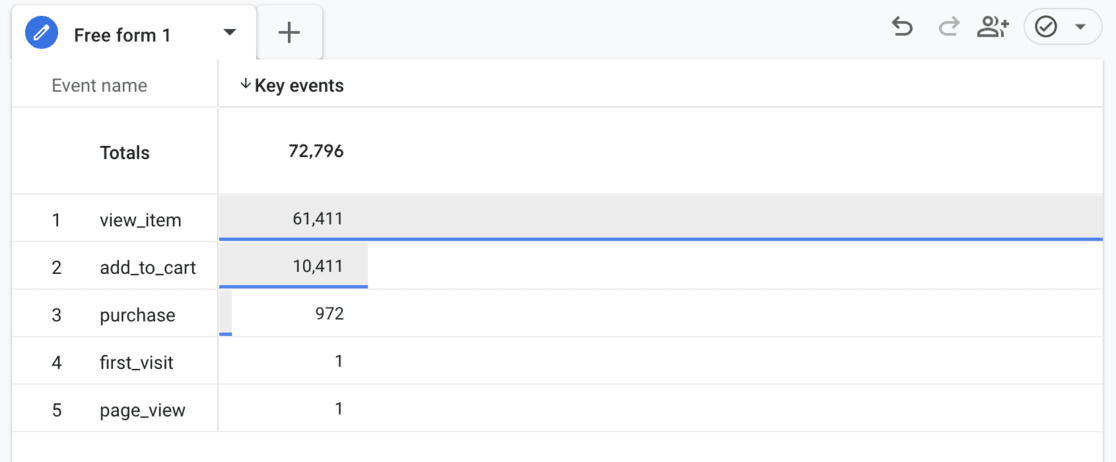
You can build other views of your engagement data the same way. For more ideas, our Google Analytics custom reports tutorial walks through other layouts.
8. User Stickiness
User stickiness in Google Analytics measures how often the people who visit in a month come back within a day or a week. It’s similar to new vs. returning users but goes a little deeper.
If your site’s main goal is a single conversion rather than repeat visits, this metric is less helpful.
User stickiness compares three counts of active users:
- Daily active users (DAU): people who visited in the last 24 hours
- Weekly active users (WAU): people who visited in the last 7 days
- Monthly active users (MAU): people who visited in the last 30 days
To find the report in Google Analytics, navigate to Reports » Engagement » Overview (the report opens as Engagement overview). Then, scroll down to the User stickiness card.

These percentages show how “sticky” your users are, or how often they return. The higher the percentages, the more often your users come back to your site.
The card plots three ratios. Its legend lists them as DAU/MAU, DAU/WAU and WAU/MAU from top to bottom. The labels can get shortened on a narrow screen, so hover over a line to see its full name.
WAU/MAU is the share of the month’s visitors who also visited within the last week. DAU/WAU is the share of the week’s visitors who also visited in the last day. DAU/MAU is the share of the month’s visitors who also visited in the last day, so it can never sit above WAU/MAU.
So, a DAU/MAU of 50% means half of the people who visited in the last 30 days also visited in the last 24 hours.
For a tour of the other standard reports around this card, see our Google Analytics reports guide.
9. Scroll Depth and Event Count
Scroll depth shows how far down a page visitors get, and event count shows how many times a tracked action happened. Together, they tell you whether people reach your content and calls to action or stop partway down.
Google Analytics has a built-in scroll event as part of enhanced measurement. It fires once per page, the first time a visitor reaches 90% of the page’s vertical depth.
You can see how often it fired in Reports » Engagement » Events. The Event count column there shows the total for each event name.
Because that event fires only at 90%, it can’t show where readers stopped before the end. A visitor who read 80% of a long guide looks the same as one who left after the first paragraph.
If readers aren’t getting far enough down the page, moving key content and calls to action higher up can help more of them see it.
Our scroll depth tracking guide shows how to record more scroll points than the single 90% event.
How to See Engagement Metrics in WordPress with MonsterInsights
MonsterInsights brings your Google Analytics engagement data into your WordPress dashboard. You can check whether visitors stay, come back and act without opening Google Analytics.
After you add Google Analytics to WordPress with MonsterInsights, go to Insights » Reports. The Overview report opens on the Traffic tab, so click Engagement to switch views.
The Engagement tab charts Sessions, Engaged Sessions and Engagement Rate over your date range. Below the chart, the Key Metrics row lists Sessions, Engagement Rate, Bounce Rate, New Users, Returning Users and Session Duration.

If engagement rate dips while sessions climb, that can mean a traffic spike brought visitors who didn’t stick around. The Metrics dropdown above the chart also lets you add lines such as Bounce Rate or Pageviews / User.
To compare how first-time and repeat visitors engage, scroll down to the Demographics panel and click its New vs Returning tab. It shows sessions and engagement for each group side by side.
To see which channels send engaged visitors, open Traffic » Source / Medium on a Plus plan or above. The Source / Medium Details table lists sessions and engaged sessions for each source.

Comparing the Sessions and Engaged Sessions columns shows which channels bring visitors who stay, not just the most visitors. Our guide to finding the traffic sources that convert goes deeper into judging channel quality.
On Plus plans and above, MonsterInsights also records scroll depth automatically at 25%, 50%, 75% and 100% of each page. Open the Publishers report and find the Scroll panel, which shows your Average Scroll Depth across all pages.

MonsterInsights also includes an AI assistant, Charlie, on every plan, with a monthly question allowance that grows with your plan. Click the purple mascot icon in the bottom-right corner of any report page, then type into the Ask Charlie AI box.
The panel opens with suggested questions under Website Insights, so you can start with a single click.
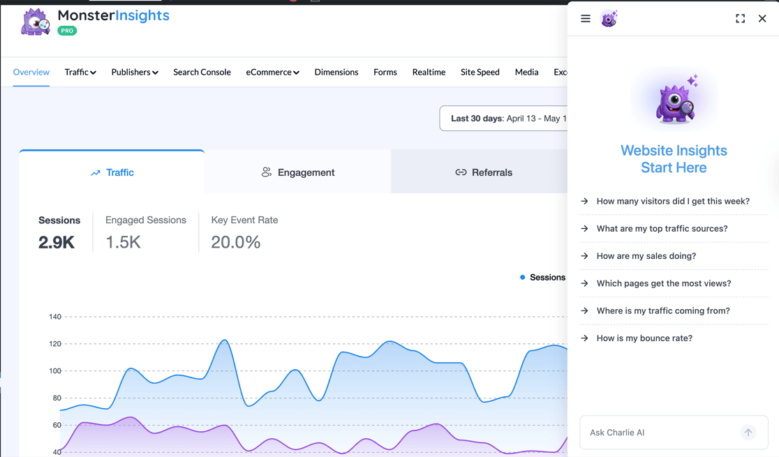
Asking about your bounce rate, for example, is a quick way to check one of the numbers in this guide without leaving the report.
See Your Engagement Metrics Without Leaving WordPress
MonsterInsights shows engagement rate, bounce rate and new vs. returning users together on the Engagement tab of its Overview report. Plus plans and above add automatic scroll depth tracking at 25%, 50%, 75% and 100%.
See MonsterInsights PlansFAQs About User Engagement Metrics
What is user engagement in Google Analytics?
User engagement in Google Analytics describes how actively visitors interact with your site. Google Analytics measures it through engaged sessions, engagement rate and engagement time, which counts only the time your page was in focus.
Which Google Analytics metrics measure engagement?
The core engagement metrics are engagement rate, bounce rate, average engagement time, engaged sessions per active user and views per user. New vs. returning users, key events, user stickiness and scroll depth show whether people come back and take action.
What counts as an engaged session in Google Analytics?
An engaged session is one that lasts longer than 10 seconds, includes two or more page or screen views, or records a key event. The 10-second timer is a default, and you can change it in your web data stream’s tag settings.
What’s the difference between engagement rate and bounce rate?
Engagement rate is the percentage of sessions that were engaged, and bounce rate is the percentage that weren’t. The two always add up to 100%, so they’re two ways of reading the same number.
What is a good engagement rate in Google Analytics?
A good engagement rate depends on the page and the traffic source, so there’s no single number to aim for. A quick-answer post and a long guide can both serve readers well with very different rates. The most useful benchmark is your own, so compare each page and channel against your site’s average and watch the trend.
How is average engagement time calculated?
Google Analytics adds up the time your site was in focus in visitors’ browsers and divides it by the number of active users. Time a page spends in a background tab doesn’t count.
Does user engagement affect SEO?
Google has said it doesn’t use Google Analytics data as a ranking signal, so the numbers in your reports don’t feed rankings directly. The changes that raise engagement, like clearer answers and better next steps, also make a page more helpful to searchers.
Engagement metrics show you which pages are working and which ones only get visited. We hope this guide helped you pick the right metrics to measure user engagement on your site. If you liked this article, check out the following beginner-friendly guides:
- Important Google Analytics Metrics to Track
- User Behavior Analytics: Tools, Key Metrics & More
- GA4 Funnel Exploration Reports: Beginner’s Guide
- Your Ultimate Guide to MonsterInsights Dashboard Reports
- The Beginner’s Guide to Google Analytics Custom Dimensions
Follow us on Twitter, Facebook, and YouTube for more Google Analytics tips.