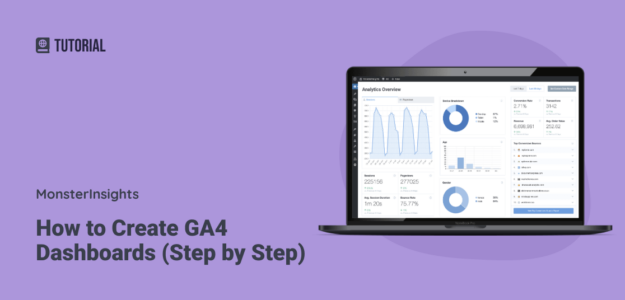
Wondering if it’s possible to create custom dashboards in Google Analytics 4?
For those who created your own dashboard in Universal Analytics, you’re probably wondering if there’s something similar you can do in GA4. Although GA4 dashboards differ quite a bit from Universal Analytics dashboards, you can still create them!
If you didn’t use Universal Analytics, you probably just want to be able to combine your most-used reports into one dashboard.
Either way, you’re in the right place.
In this article, I’ll look at what Google Analytics dashboards are, how you can make them, and what tools you can use to make looking at GA4 data easier.
Google Analytics 4 Dashboards Video Walkthrough
What are Google Analytics (GA4) dashboards?
Google Analytics 4 (GA4) dashboards are customizable areas within GA4 that display key metrics and data visualizations. These dashboards help users track website or app performance, user behavior, and other analytics in real time. Users can personalize dashboards by adding specific report cards to highlight the most relevant data.
Dashboards are convenient because they allow you to see all of your most important metrics together on one screen instead of clicking through multiple reports.
In Universal Analytics, creating custom dashboards was pretty easy. It’s a bit different in Google Analytics 4, but you can still make GA4 dashboards! In fact, there are several different ways to create them, using various tools and methods.
3 Ways to Create Google Analytics Dashboards
There are a few different approaches you can take to create GA4 dashboards. Let’s take a look.
- Option 1: Customize the GA4 Reports Snapshot
- Option 2: Install MonsterInsights on WordPress
- Option 3: Use Looker Studio
Option 1: Customize the GA4 Reports Snapshot
When you log into GA4 and navigate to the Reports tab, the first thing you’ll see is the Reports Snapshot.
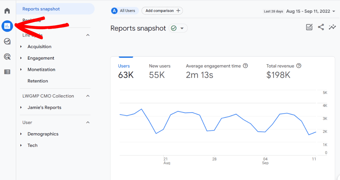
The Reports Snapshot is a pre-made Google Analytics dashboard that gives you an overview of your website’s performance. Although it’s a great start, this dashboard probably includes reports you won’t use or doesn’t have a report “card” that you want it to have.
You can edit this report to customize it to meet your unique website’s needs.
To start, click the pencil icon in the upper right corner of the screen:
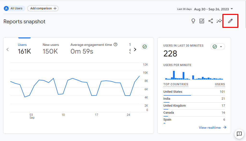
That’ll open a Customize Report side panel:
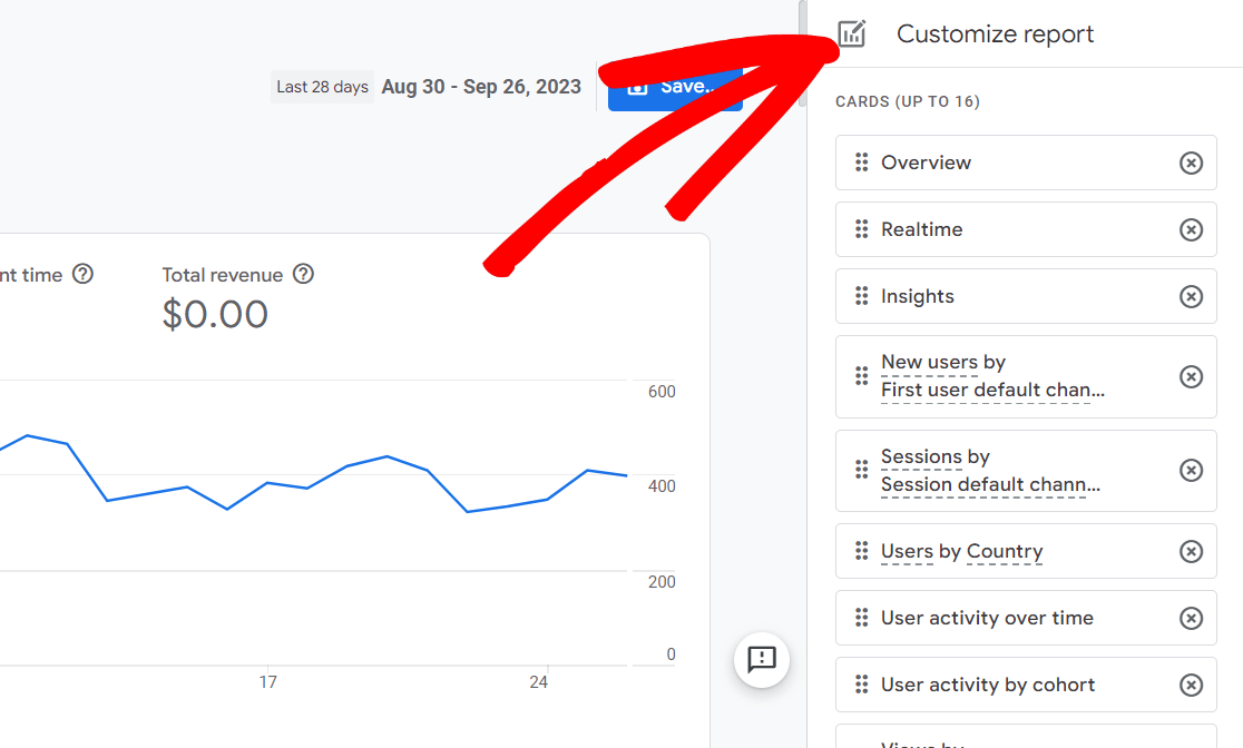
Here’s where you’ll see each of the cards in the report. It can hold up to 16 of them and comes with 13 cards by default.
First, notice that you can rearrange the cards by clicking the six dots on the left and dragging a card to a new location.
Unfortunately, the cards aren’t editable. So, if you’d like to change a certain one, you’ll have to click the X on the right to delete it, then remake it and add an updated card yourself.
To create a new report card, scroll to the bottom of the list and click Add cards:
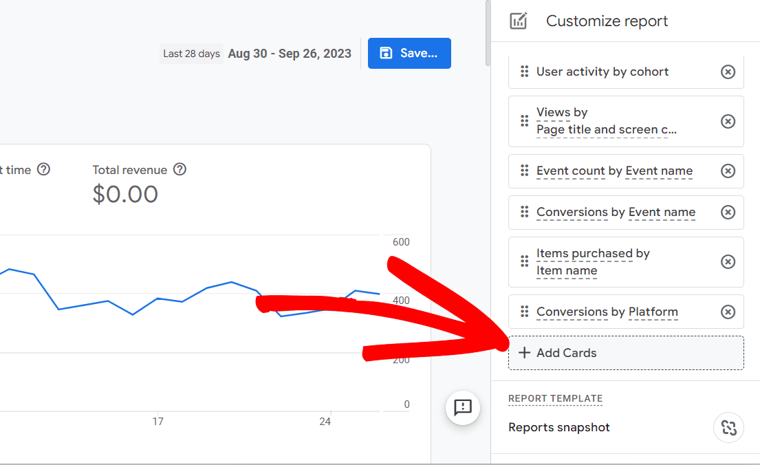
Here, you can select from Google’s pre-made cards to add to your dashboard. Unfortunately, if you’re looking to add something that isn’t there, it can’t be added at this time, and you’ll want to look at the other methods of creating a GA4 dashboard.
There are a couple of things about this page that you should note. First of all, notice that there’s a second tab with more report cards that you can look at:
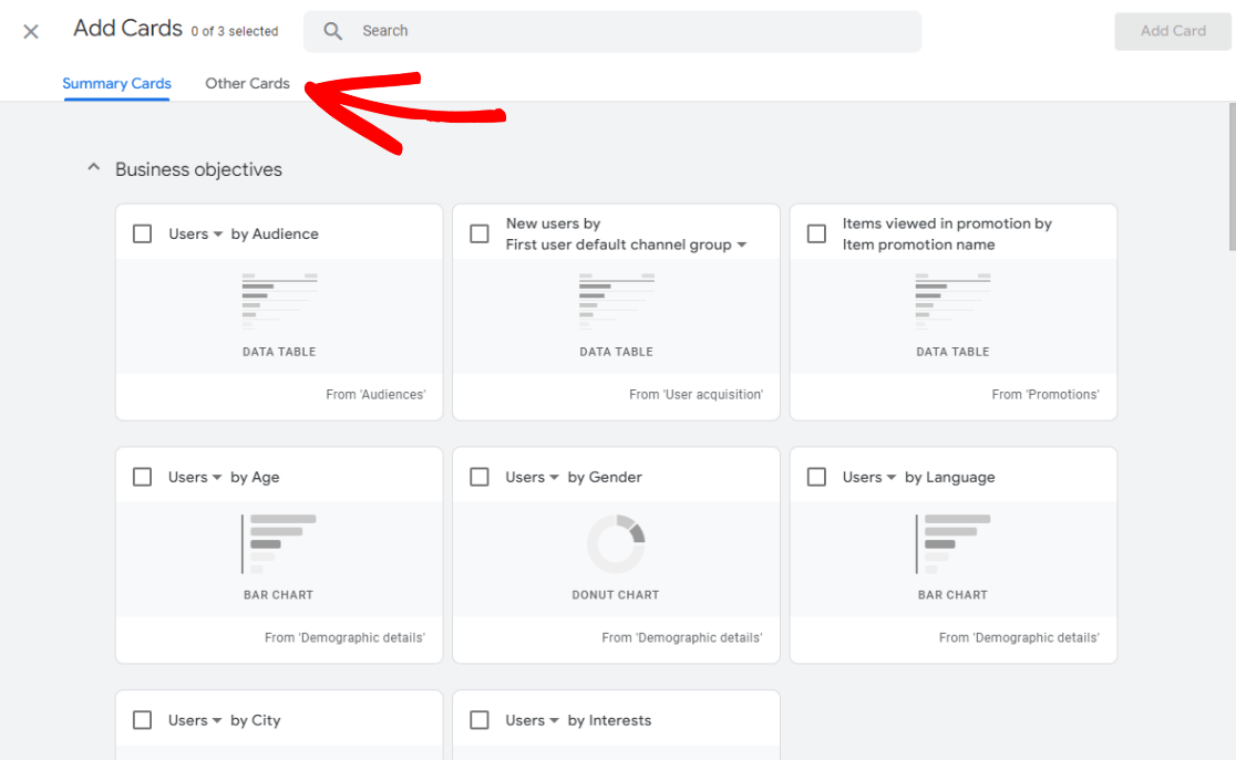
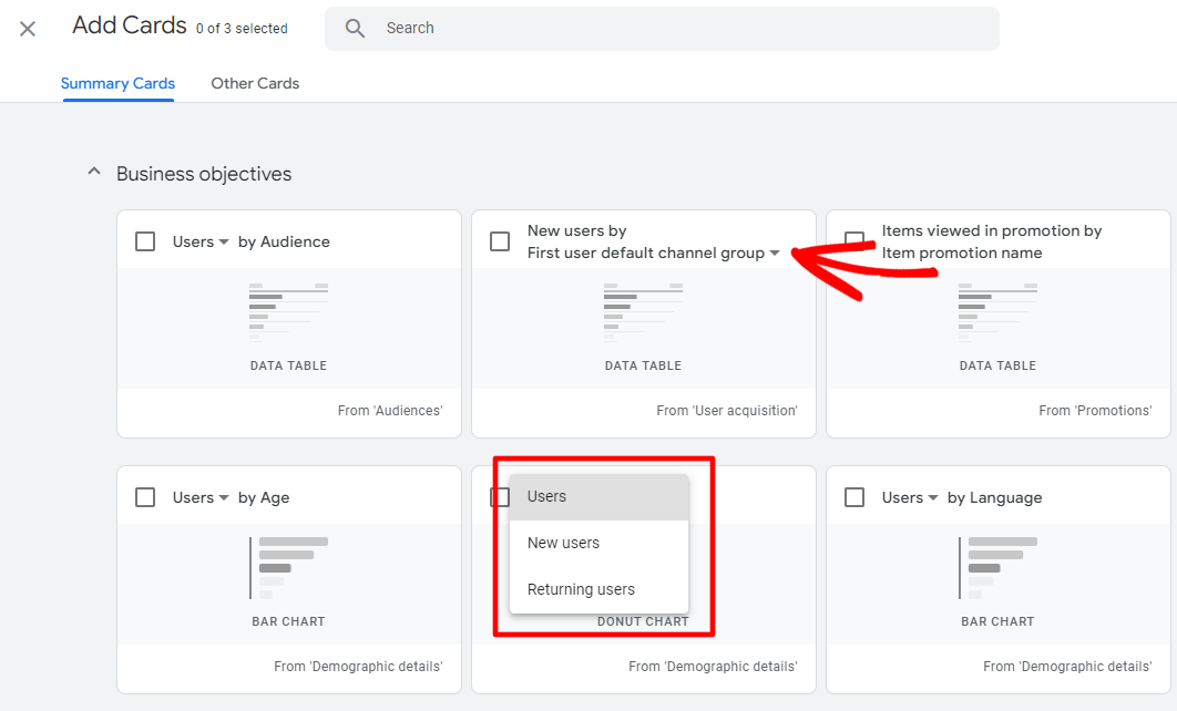
Also, make sure to check out the other dimensions that are available for each card by clicking the down arrow when it’s available:
If you find a card you’d like to add to your dashboard, click the checkbox and then the blue Add Card button.
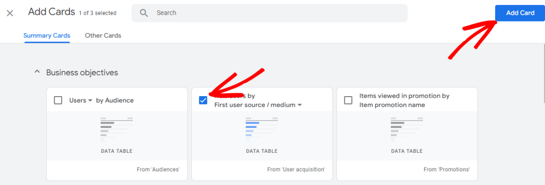
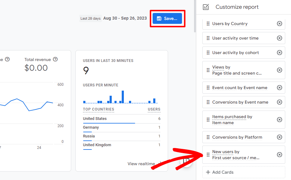
Your new card will automatically be added to the end of your list of cards, so it’ll be at the end of your report. If you want to move it up, remember to click and drag it up into a new position. When it’s situated where you’d like, go ahead and click the blue Save button:
Next, unless you’re trying to create a whole new dashboard, you’ll want to click the Save changes to current report option:
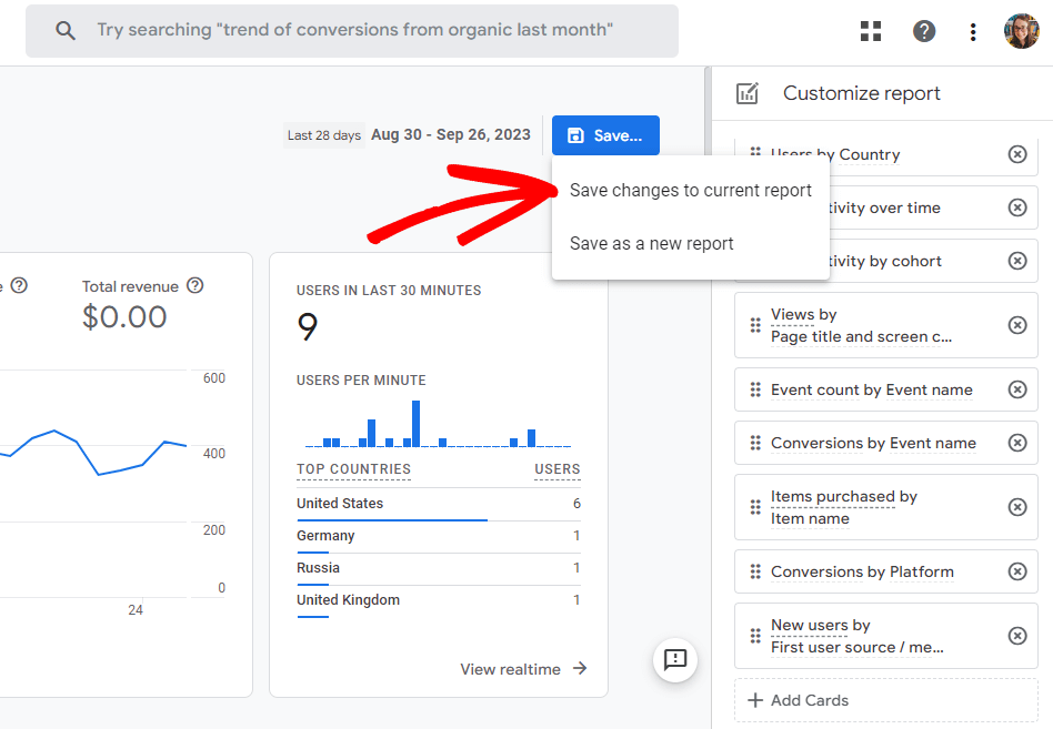
A pop-up will then ask if you’re sure – go ahead and click Save.
That’s it! You’ve edited your standard GA4 reports overview dashboard.
If your site is built with WordPress, you’ll really want to see our next option. Not on WordPress? Skip to option 3.
Option 2: Install MonsterInsights on WordPress
Hoping for more of a super easy, done-for-you method of GA4 dashboard reporting? If your site is built with WordPress, we’ve got an awesome option for you: MonsterInsights.
MonsterInsights is the best Google Analytics plugin for WordPress. It allows you to easily connect your WordPress site with Google Analytics so you can view all the data that matters most right in your WordPress dashboard.
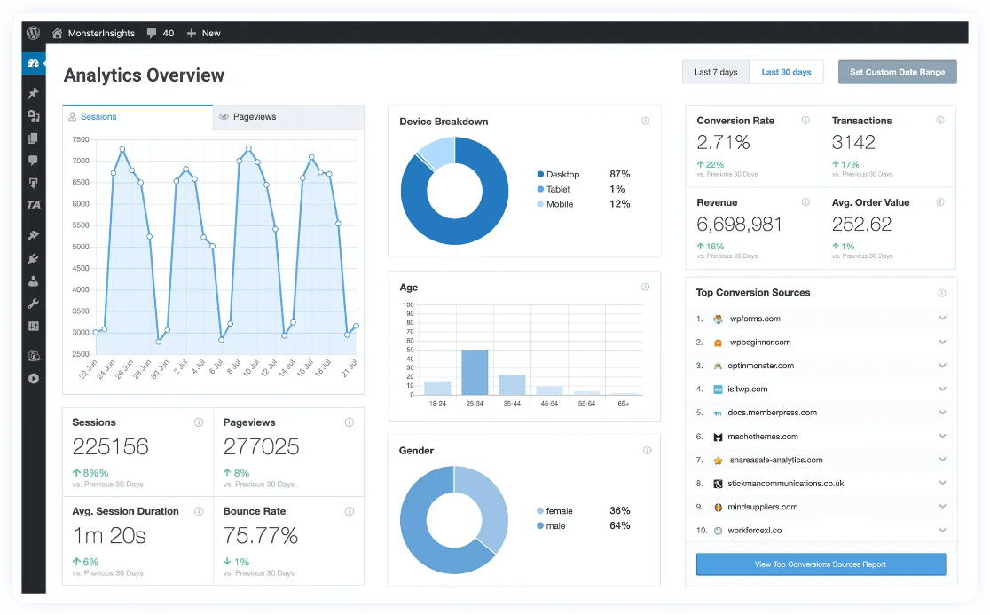
Plus, with the click of a button, you can set up sophisticated tracking features such as event tracking, eCommerce tracking, form tracking, custom dimension tracking, outbound link tracking, and more.
Use the MonsterInsights dashboard widget to add important stats right to your home WordPress dashboard, or visit the Reports area (also inside your WordPress dashboard) for all of our straightforward and easily readable reports, such as:
- Pages and Landing Page Details
- Channels
- Source/Medium
- Search Console
- eCommerce
- Coupons
- User Journey
- Site Speed
- Media
- And more!
With MonsterInsights, you can see all your most important stats without leaving WordPress or opening Google Analytics.
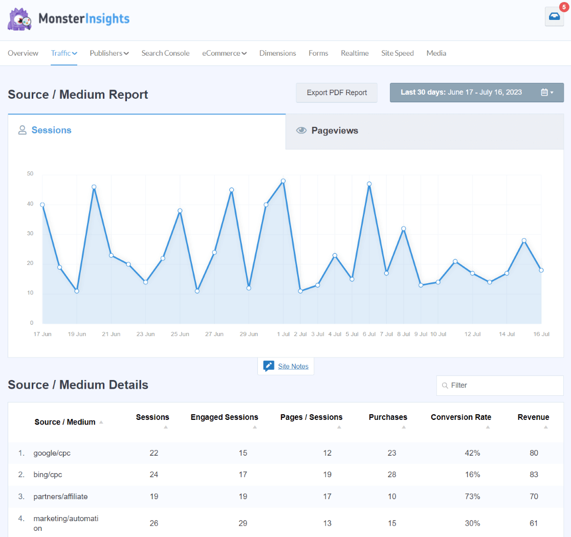
Besides adding your Google Analytics stats to WordPress, MonsterInsights sets up multiple more complicated tracking features for you, so you don’t have to try to puzzle them out. For instance, you can set up eCommerce tracking, author tracking, user journey tracking, video tracking, and more with just a couple of clicks.
To get started, look at the reports available at our different license levels and choose the one with the features you need.
Want to start with just your basic stats? Use the free version of MonsterInsights.
Looking for a full tour of MonsterInsights first? Check out our Ultimate Guide to MonsterInsights Dashboard Reports.
Option 3: Use Looker Studio
Looker Studio is Google’s free tool for building your own GA4 dashboard. Although it has a learning curve, it’s a really neat tool that you can use to create the exact reports you want.
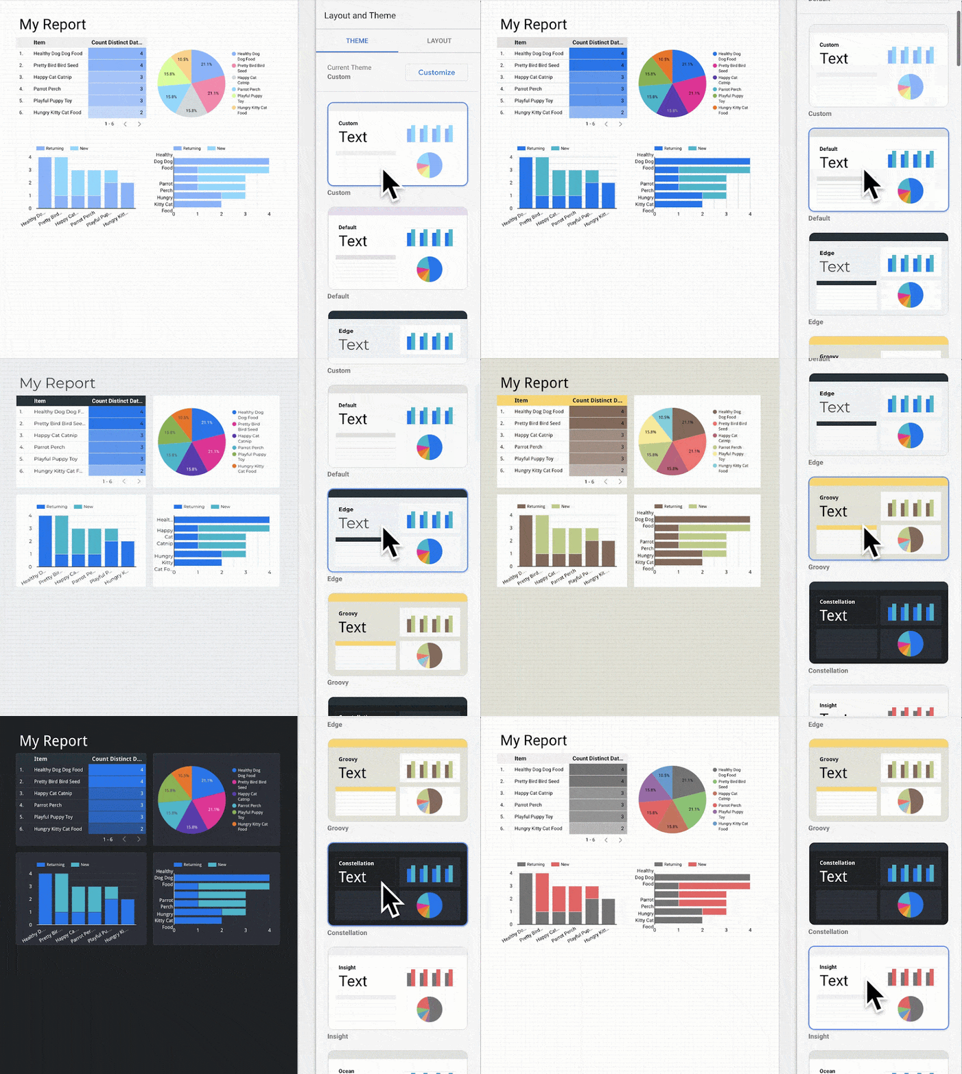
We won’t be diving into a full Looker Studio tutorial here. That would be a lot! Instead, Google has extensive instructions for how to use it. Start with the Looker Studio Quick-Start Guide.
That’s it!
I hope you found a good method that works for you in my guide for creating a GA4 dashboard.
If you liked this article, you might also want to take a look at:
How to Create Google Analytics 4 Custom Reports (Step by Step)
Top 11 Important Google Analytics Metrics to Track
Top 5 User Engagement Metrics for Your Website Explained
How to Track Button Clicks in Google Analytics 4 (No GTM!)
Not using MonsterInsights yet? What are you waiting for?
And don’t forget to follow us on Facebook and YouTube for more helpful Google Analytics tips.
Analytics Dashboards FAQ
How do I create a custom dashboard in Google Analytics 4?
To create a custom dashboard in GA4, follow these steps:
- Navigate to the reports snapshot: Log in to your GA4 property and click on the “Reports Snapshot” tab on the left-hand menu.
- Click the pencil icon: Find the pencil icon in the upper right corner of the screen and click it to open a Customize report panel.
- Remove any unwanted cards: Click the X on any of the cards you want to remove from your dashboard.
- Click Add card: Scroll down and click on Add card to add a new report card to your dashboard.
- Choose a summary card or one from the Other Cards tab: Choose and customize the report card you’d like to add.
- Rearrange your cards: Click and drag the report cards in your list to rearrange them on your dashboard.
- Save your dashboard: Click the Save button to save the changes you’ve made to your reports overview dashboard.
Are there pre-built dashboard templates available in GA4?
Yes. Every report section in Google Analytics 4 has an editable overview report that acts as a dashboard for that section of reports.
Is it possible to schedule email reports from GA4 dashboards?
Yes, as long as you have administrator access to the Google Analytics account. Click on the Share icon in the upper right corner of any report, then click on Schedule Email.
Is there a way to export data from GA4 dashboards?
Yes. Click on the Share icon in the upper right corner of your report, then click on Download File.
