Do you know how to use landing pages to grow your business and web traffic? If not, our proven list of landing page best practices will help you turn more visitors into customers and subscribers.
In this article, we’ll also tell you what landing pages are for and why you need them. And, we’ll recommend some tools to help you easily build and track your own landing pages, without any programming.
Okay, let’s go over a few basics, and then we’ll get to our list of best practices for landing pages.
What Is a Landing Page?
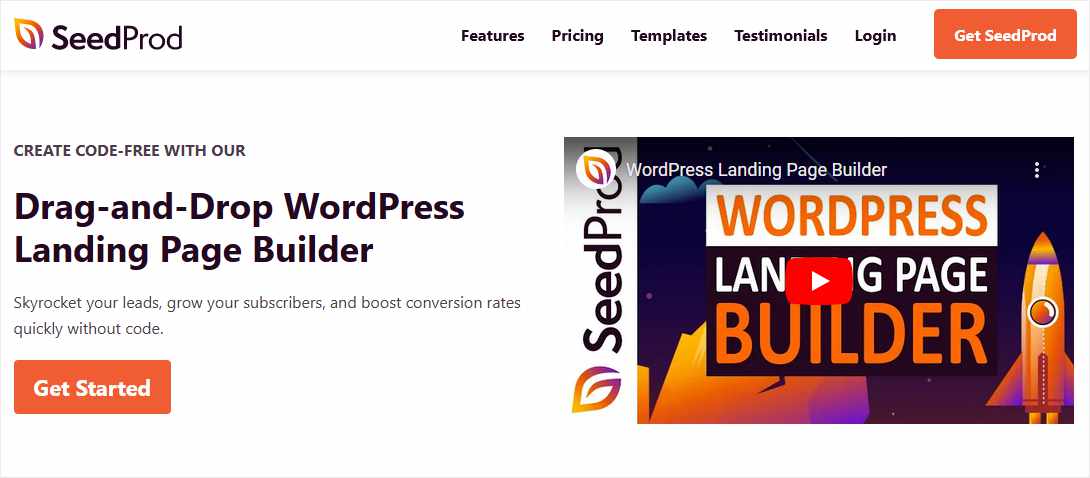
A landing page is a web page that stands alone, separate from the rest of your website, in order to accomplish a single goal. Well-designed landing pages have one main purpose and one call to action (CTA). In the example below, the CTA is “Get started.”

The goal of our example page is to collect a website visitor’s email address. Then you can use this contact info in the future for marketing or some other purpose.
You might also build a landing page to offer a product at a special discount, or to introduce a new product.
Landing pages used to collect contact info are called lead generation pages, lead capture pages, opt-in pages, or squeeze pages. A lead generation landing page often contains an offer for a free product, which is called a lead magnet.
Landing pages with a highly focused goal tend to convert at a higher rate than a more general page like your site’s home page. Visitors to your home page have many choices and options, so it’s harder to get them to follow a particular path than if you use a dedicated landing page.
Examples of Landing Pages
As we noted, landing pages are used for several different business purposes. Here are some popular types of landing pages and examples of how they might be used:
- Sales Landing Page – This type of landing page is commonly used as the target of an ad on Google or social media. The sales landing page shows the details of your special offer, with a buy button that leads to a checkout page.
- Lead Magnet Page – A lead magnet page presents an offer of a free downloadable product or free service that the user can access only by providing contact information.
- Subscriber Signup Page – Signing up newsletter subscribers to build your mailing list is one of the most proven and effective online marketing strategies. Create a dedicated newsletter landing page to convert a higher number of visitor signups.
- Event Registration Page – If you’re hosting an online event like a webinar, a landing page with event details and a signup form makes it easy for people to register.
- Coming Soon and 404 Pages – You can direct website visitors to a Coming Soon page to announce a new business or website launch. Or, you can set up a 404 page so that any broken URLs on your site will send visitors to a custom page with any content you like.
For more inspiration, check out these examples of real landing pages that have a track record of converting visitors.
Now that you have some ideas about how and why you might want a landing page, let’s get into our list of best practices!
Proven Landing Page Best Practices to Increase Conversion Rates
1. Focus Users with One CTA
2. Match the Audience to Your Offer
3. Make Landing Pages Visually Appealing
4. Minimize Landing Page Copy
5. Write a Compelling Headline
6. Add Social Proof to Your Landing Page
7. A/B Test Landing Page Elements
8. Make Your Form Visible
9. Reduce or Eliminate Scrolling
10. Don’t Add Outgoing Links
11. Test Landing Pages on Different Devices
1. Focus Users with One CTA
When you create a landing page, it should only contain one primary call to action that you want visitors to perform. Let’s say your CTA is for your site visitor to buy a product after reading the copy on a sales landing page.
You might have multiple buttons on that landing page, but they should all lead to the same order or checkout page. The CTA is the same for every button or text link, even if the wording of the links and buttons are different.
Don’t ask people to buy a product and sign up for a newsletter on the same page, in other words. If you want new customers to sign up for a newsletter, you can direct them to a signup page after they complete their purchase.
2. Match the Audience to Your Offer
In order to maximize your conversions and minimize bounce rates, be sure that your offer and your audience are a good match. This is especially important if you’re sending paid traffic to your landing page, so that you don’t waste money by promoting your offer to the wrong people.
If you’re going to experiment with the traffic you send to your landing pages, it’s better to start with a smaller, more restricted target audience. Once you hit your target conversion rate with this audience, then you can start expanding your marketing to scale up.
3. Make Landing Pages Visually Appealing
You’ll get more sales and subscribers with a landing page design that is attractive to visitors and invites them to slow down and read the text. Just as your offer should be crafted to match your ideal audience, so should your landing page design.
The best way for non-graphic designers to do this is by using a tool that offers built-in landing page templates with layout and image editing options. With a little practice, anyone can make an attractive landing page that encourages users to stop and take a look.
4. Minimize Landing Page Copy
How much text should you put on a landing page? That depends on a number of factors. The copy should be just long enough to sell the offer you’re presenting, and no longer. The best amount of copy text is sometimes related to the level of commitment you’re asking for.
For example, if you’re selling a product that’s priced over $100, your copy should probably be longer than if you’re selling a $10 product. Are you giving away a free lead magnet in order to gather emails, or asking people to register for a webinar? Your copy should be extremely brief and focus on the benefits of the lead magnet or webinar content.
5. Write a Compelling Headline
Your headline may be a small portion of your landing page copy, but it has a big impact. The headline should give readers an idea of your offer and the call to action.
Most importantly, your landing page headline should contain your offer’s biggest benefit to the reader. Like, “Crush Your Competition with Our FREE SEO Traffic Tips.” The headline doesn’t say that you’re offering an email newsletter. Instead, it tells visitors the beneficial end result of reading your newsletter.
Try these headline analyzer tools for more help crafting a winning headline.
6. Add Social Proof to Your Landing Page
If you want someone to buy a product or invest time in a webinar, they might need more persuasion than if you’re asking for an email address. In that case, you need more than a headline and a catchy tag line to get people to act.
Add quotes, testimonials, or reviews from other users to your landing page to show you’re trusted and to highlight benefits received by past customers of your product or service. This type of copy is called social proof, because it proves to potential buyers that your offering has worked for others.
7. A/B Test Landing Page Elements
Landing pages are great for experimenting and testing visitor behavior. You should start testing as soon as you can to see which changes result in higher conversion rates. Prime items to test are headlines, body copy, button text and color, layout, and even form fields and labels.
Best practices for A/B testing recommend that you only change one element from your control version at a time. When you find a change that significantly improves results, make that version your new control and repeat the process.
8. Make Your Form Visible
If you are including a form or email capture field that users have to fill out on your landing page, make it visible above the fold. Making people scroll down the page to enter their info is a sure way to decrease the number of visitors that complete your forms.
It goes without saying that if your form should be visible, the CTA should also be visible so users can click without scrolling. That also means putting multiple buttons or links on your landing page so your CTA is in sight no matter what part of the page a user is looking at.
9. Reduce or Eliminate Scrolling
Landing pages with a simple request for users should be completely visible on a single screen. That is, don’t make users scroll more than necessary to see the entire page and all the text and images.
The exception to this best practice is for landing pages that are promoting a complex or expensive offer. Some sales landing pages that convert well may contain thousands of words of text, images and video, and other visual elements that help convince readers to accept an offer.
10. Don’t Add Outgoing Links
Since you want landing page visitors to be directed toward a single action, don’t add any extra links or navigation elements that distract or draw them away from the page.
Landing pages often include a website’s main header menu to allow users an exit, but it’s best not to offer any other navigation options in the footer or sidebar areas. You also want to avoid adding any outbound text links or buttons in the copy aside from your main CTA.
11. Test Landing Pages on Different Devices
With the majority of internet traffic now taking place on mobile devices, you need to design your landing page to be responsive and appealing on any size screen. Find a tool that allows you to test your landing page display on several differently sized screens.
Make sure that smartphone users have a positive user experience on your landing page, too. Beware of long headings that break into more than two lines, images that are too small to see, and paragraphs that stretch too far down the page.
And that wraps up our list of the top landing page best practices to improve your conversion rates. No matter what purposes you use landing pages for, these tips should help you gain more sales, signups, and revenue.
Now that you know these proven methods for designing landing pages, how can you actually build a landing page and start using it? Let’s take a look at the most efficient way for WordPress users to add a landing page to their site using a landing page design plugin.
Best Tool to Create Landing Pages in WordPress
The SeedProd plugin for WordPress is a landing page builder that lets WordPress users create professional quality landing pages with no advanced graphics or technical skills.
SeedProd includes nearly 200 templates for all different sorts of landing pages. Whether you need a sales page, an opt-in page for email capture, or a coming soon page, you’ll find many pro designs to start with.
Even if you can’t find the absolute perfect landing page template, don’t worry. SeedProd has a drag-and-drop editor that makes adding and editing incredibly easy. You can revise the layout, change images, and add or remove fields until your design looks just the way you want.
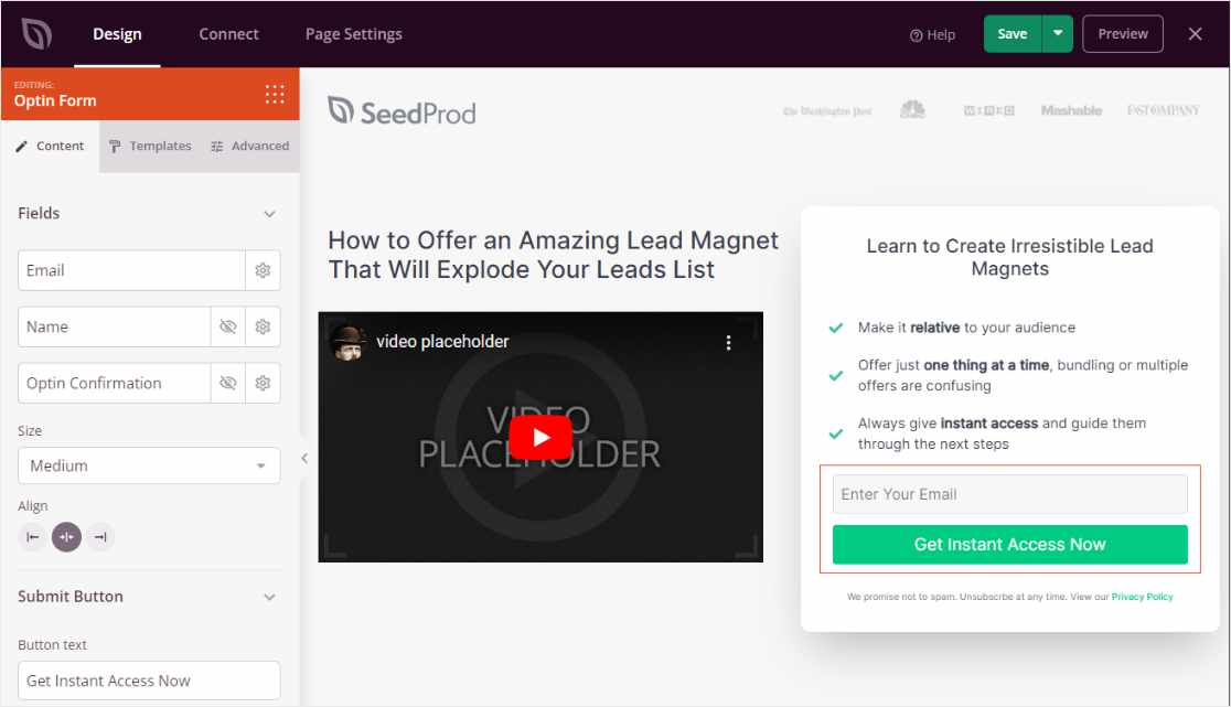
When it comes to displaying landing pages, SeedProd creates your pages as standard WordPress pages. So, you can display and manage landing pages just like all your other web pages.
We’re just scratching the surface of all the powerful features available with SeedProd landing pages. All of its landing page templates are designed to be responsive to adapt to any size screen, and there’s a preview tool built into SeedProd so you can test your landing page display on multiple device types.
One final benefit of using SeedProd to make landing pages is its integration with multiple email platforms. This lets you automate the addition of new subscribers to your mailing lists and marketing campaigns.
Go try making a new landing page in SeedProd, it’s fun!
How to Track Landing Page Performance on WordPress
After you start using landing pages on your WordPress website, you’ll want to start tracking stats on your landing page performance.
Fortunately, that’s an easy task if you use another plugin to connect your site with Google Analytics data. MonsterInsights is the best WordPress plugin for Google Analytics. It shows you critical analytics data from Google directly in the WordPress dashboard.
MonsterInsights instantly shows you the top 50 landing pages on your site ranked by number of visits. All you need to do is click Insights » Reports and check out the Publishers tab.
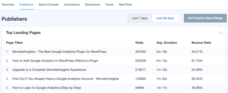
Just be aware that this list of landing pages will show you all the pages that visitors used to first enter your site. To see all the landing page metrics available in your Google Analytics account, click the button at the bottom of the list, View Full Top Landing Pages Report.
To find out how to get even more detailed stats on your landing pages, read our post on how to set up a landing page report in Google Analytics.
If you need help getting started with MonsterInsights, here’s a full tutorial on how to connect Google Analytics to WordPress using the MonsterInsights plugin.
Not using MonsterInsights yet? What are you waiting for?
And, don’t forget to follow us on Twitter, Facebook and YouTube for more helpful Google Analytics tips.
- Make the Form Visible
